The pitch deck is a staple of modern entrepreneurship — folded into the startup survival process. As a growing business, how compelling and intriguing yours is can be the difference between getting the capital you need to get off the ground and getting buried before you have the chance to make something of your company.
An exceptional pitch desk is a solid asset for any business looking to secure funding and take that next step. But a mediocre one is easy to pass over and can undermine how cutting-edge or viable your company actually is.
Every entrepreneur needs to have a solid grasp on the concept, so here, we'll get a more definitive picture of what a pitch deck is, review some of the information you need to include in yours, go over some programs you can use to construct one of your own, see some examples to use as reference points, and pin down how to make yours as engaging as possible.
Pitch decks aren't keynote presentations. You're not trying to blow people away with deep dives and fancy language. The best ones are succinct, straightforward, and easy to digest. Yours needs to be lean — fleshed out with your most impressive, relevant information and organized with some degree of flow and cohesion.
There are certain boxes you need to check — information you need to convey concisely and engagingly. And you need to get those points across without bloating the presentation with too much fluff.
Here are the bases that your pitch deck should cover.
1. Basic Company Information
Start with the fundamentals. It might go without saying, but you need to let your audience know exactly who you are. Include your logo, company name, and contact information — specifically, your phone number and email.
You have to make yourself readily accessible to investors. That's tough to do if you don't include the necessary, baseline details to help them identify and reach you.
2. The Problem
Why does your company exist? What are you trying to remedy? Who does it impact? And why does it matter? You need to communicate some degree of urgency with your pitch deck.
Be able to present a pressing, relevant problem that a significant base of prospects goes through. If you can't show that you're solving a real, meaningful issue, your potential investors will likely tune out or ditch your deck at this point.
3. The Solution
Okay, so you've established there's a real problem that impacts a lucrative niche. Now, you have to show how your product or service, specifically, can be used to solve it.
Give a fundamental picture of your value proposition here. What does your solution do? Don't get too caught up in describing specs and features — you're better off providing a higher-level overview in this section.
4. Your Business Model
Investors need to have a picture of how you plan on acquiring customers and making money — that's kind of the whole point of investing in a startup. That said, the nature of this section is pretty fluid. As you scale and new challenges arise, your business model will probably change.
The key here is to present a cogent roadmap that demonstrates your critical thinking and strategic planning skills. Show your investors that you're thoughtful and business savvy — the model itself probably isn't set in stone.
5. Information About the Competitive Landscape
Who are your competitors? How do you stack up against them? How do they serve your target audience? How big is your market in general? Give your potential investors a picture of what you're up against.
Then, explain your competitive advantages. Show them what you have that the other side doesn't. Investors want to know that you'll be able to set yourself apart, so prove that you're not going to be just another face in the crowd.
6. Product or Service Specs and Benefits
Here's where you get into your features a bit. See if you can show what your product or service looks like in practical use. Images are an excellent way to support this. Use mediums like screenshots, diagrams, blueprints, or even real pictures — depending on the nature of your product or service.
7. A Financial Forecast
This is one of the most crucial components of an effective pitch deck. Investors are investing because they want to make money — that's the literal purpose of investing. You need to show them that your operation is financially viable.
Include relevant metrics that can show what it will take for you to break even and ultimately make a profit. At the end of the day, investors are looking at your pitch deck for a reason, and that's to gauge the potential return you can offer. Here's where you give them a clear picture of what that could be.
8. Information About the Team
Investors aren't just investing in your product or service — they're investing in you. You need to show that you're trustworthy and competent. Include some information about you, your staff, both your and their experience, and any relevant accolades your team members might have accrued.
Put investors at ease by demonstrating that their investments are going to wind up in capable, sensible hands.
9. Information About Other Stakeholders
One of the better ways to inspire confidence from investors is to let them know they'll be in good company should they invest. Being able to tout sizable contributions from other investors can mitigate the perception of risk among the VCs looking at your deck.
By referencing success in previous funding rounds or demonstrating that reputable sources have faith in your company, you can put investors at ease and make them more inclined to hear you out — at the very least.
The points above need to be addressed, but they won't do too much for you if they're not conveyed with some style, cohesion, and grace. Let's check out some ways to make yours as engaging and thoughtful as possible.
How to Design a Pitch Deck that Doesn't Suck
1. Make your text extremely legible.
That guy who forgot to wear his contacts today and somehow ended up in the back row of the conference room? Yeah, he needs to be able to see your slides just as well as everyone else.
The significance of creating extremely legible, easy-to-read slides should not be underestimated. It's more than a matter of aesthetics: If your slides are at all difficult to read, even people with 20/20 vision are going to quickly lose interest and zone out.
They didn't come here to expend effort — they came here to be spoon-fed. And it's your job to make your information as digestable as possible. To keep the focus on your content, stick to big, bold fonts on highly-contrasting backgrounds.
Don't do this:
This font color doesn't contrast enough with the background, and the text size isn't large or clear enough to be read comfortably from a distance. Don't make your poor audience stare at this for too long.

Do this:
This font is big and bold enough to be seen from the back of the room, and it contrasts well with the background. When all else fails, a bold sans-serif font is the way to go.

2. Tell a story.
When we process information in list format, the basic language-processing areas of our brains get activated. Scientists call these sectionsBroca's area and Wernicke's area, and they're responsible for translating words we see or hear into coherent meanings — but they don't help us stay interested or retain information.
In other words, bullet points don't usually produce a very exciting reaction in our brains, leaving the rest of our minds to wander.
When our brains are given a story instead of a list, things change — big time. Stories engage more parts of our brains, including our sensory cortex, which is responsible for processing visual, auditory, and tactile stimuli. If you want to keep people engaged during a presentation, tell them a story.
Centering you presentation around a story, instead of a list of facts or figures, is essential for keeping people interested and leaving a lasting impression.
Don't do this:
This information might be impressive, but it isn't likely to stick with your audience when presented in list form.

Do this:
Weaving your impressive case study into a story is much more likely to have an impact on the audience.

3. Break everything down into extremely simple parts.
When it comes to pitch decks, it's time to wean yourself off of bullet points. Although they're still better than slapping a dense paragraph of text onto a slide and calling it a day, they can be overwhelming, and prevent your audience from really absorbing your main points.
You might think you're already simplifying your content, but take it a step further. Each slide should convey a single, simple idea — not a multiple ideas, not a multi-faceted idea, and not an idea that requires a degree in rhetoric to meticulously decode.
If it seems like you're making things way too simple, then you're on the right track. Remember — not all your talking points need to occupy real estate on your slide deck. Save the slide space for the big ideas, and talk your way through the rest.
Don't do this:
These points might seem simple, but they could be broken down even further and separated onto different slides.
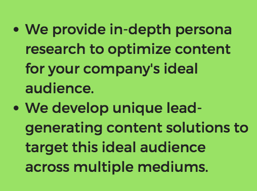
Do this:
There's nothing difficult to understand about this simple, straightforward slide.

4. Make the points obvious.
The point of each slide should be obvious. Your audience shouldn't have to work to understand what's going on, especially when graphs or charts are involved.
Any information you include on a slide should be immediately translated for the audience, even if you think it speaks for itself. Ask yourself:
- What point are you trying to make by including this piece of information?
- How does this fact or figure connect back to your main premise?
- What do you want the audience to get out of this slide?
Don't do this:
While this graph clearly shows growth, the point doesn't obviously tie back to your premise.

Do this:
The title on this slide tells the audience exactly what they should take away from the graph, directing them immediately to the conclusion that benefits your cause.

5. Focus on the prospect's challenges, not yourself.
It's safe to assume that your prospect has spent some time researching your agency, so there's no need to waste valuable presentation time talking about your accomplishments or accolades.
You aren't just convincing the audience you're amazing at your job — you're convincing them that you understand them, and that you're the best person to help them overcome their unique challenges.
The business pitch consultants at Blue Lobster recommend asking yourself a few questions to focus your presentation around your audience:
- "Who is the audience?"
- "What is their problem?"
- "How can you help?"
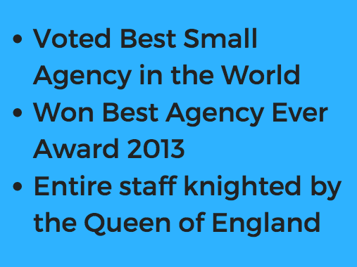
Don't do this:
While this is all very impressive, it doesn't express an understanding of your client's problems or delve into how you can help them. Plus, your prospect probably already found this information from a quick scan of your agency's website.
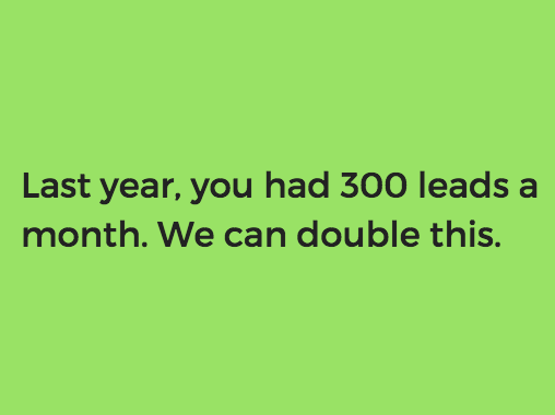
Do this:
This slide shows that you've done your research, and expresses a clear value proposition to the prospect.
6. Supplement your deck with additional materials.
Even when it makes sense to use a pitch deck, you don't need to spend the whole presentation talking at your audience. Instead, consider supplementing classic pitch decks with additional materials, such as "handouts, prototypes or posters to encourage discussion so the presentation and the presentation deck are not seen as one and the same."
Now that you have a picture of what your pitch deck needs to contain and how it can best be conveyed, let's take a look at some of the pitch deck-creation resources you have at your disposal.
1. Canva
Canva is an attractive option for any startup looking to easily create visually compelling pitch deck slides without design experience or a substantial budget. It's a simple, straightforward program that has a variety of pitch deck slide templates available.
2. HaikuDeck
HaikuDeck is another straightforward design software that reconciles accessibility with powerful functionality. It features a simple interface and boasts a wide range of different presentation templates — including ones for compelling pitch decks.
3. Slidebean
Slidebean separates itself from similar programs with its available library of pitch deck templates. It actually provides presentation formats pulled directly from various companies' successful startup pitches — offering a series of unique, provenly effective avenues for emerging businesses to take.
4. Google Slides
Google Slides is a staple of the GSuite — and for good reason. It's an accessible, no-nonsense, free solution that virtually any startup can figure out. With hundreds of pitch deck template integrations available online, Google Slides is one of the better options businesses have when constructing their pitch decks.
Let's see what these concepts, structures, and points look like in practice.
Pitch Deck Examples
Here's a look at some pitch decks that delivered results.
Uber
MatterMark
AppVirality
Castle
Pitch decks aren't going to go away anytime soon — no matter how many pitches start to come in the form of crazy stunts. Sometimes, a pitch just demands a straightforward, no-frills presentation. And in those cases, you've got to bite the bullet, swallow your creative pride, and open your presentation software of choice.
So, given how fundamentally ingrained in startup culture they've become, it's in your best interest to have a grasp on the nature of pitch decks and a picture of how to do them right.
Editor's note: This post was originally published February 16, 2017 and has been updated for comprehensiveness.
No comments:
Post a Comment