In 2018, there were over 3.7 billion email users around the world. By 2022, this number is expected to increase to 4.3 billion.
A group within that large number of users includes your business’s target audience, the people you want to market your brand, products, and services to via email.
To ensure your emails stand out and grab the attention of these target audience members, you must consider email design.
What is email design?
Email design is the process of strategically designing and creating an email that resonates with your business’s target audience, specifically your current email subscribers and customers. The design should be attention-grabbing, aesthetically-pleasing, and on-brand so recipients recognize it’s from your company.
Why is email design important?
The average recipient spends about 1.1 seconds scanning an email prior to deciding whether or not they want to stay or abandon the message.
That’s why email design — design that makes your email organized, attention-grabbing, on-brand, and valuable — is so important to the success of your marketing efforts. It's how you effectively keep recipients reading and interacting with your email content.
Now you’re probably thinking: That sounds great, but how do I design my email to attract my target audience and keep their attention on my email?
To begin, keep these 12 email design best practices in mind.
1. Craft a strong subject line.
Your email subject line is the first thing anyone sees when you send them an email. It’s the brief statement that’s supposed to pique the interest of your recipients. It should capture their attention so they want to open the email and continue reading.
Your subject line should do three main things:
- Grab the attention of your readers in as few words as possible (less is more).
- Provide some sort of value and/ or information that makes them want to open the email.
- Summarize what recipients are going to read and/ or see once they open the email.
Here’s what a subject line looks like in your email inbox:

Here’s what a subject line looks like in your mobile device’s email inbox:

You can also review some of the best email subject line examples for more inspiration.
2. Write an attention-grabbing preheader.
Your email preheader is a preview of what the email is about, similar to the meta description of a web page. It’s the second thing recipients see.
Rather than rewriting the first sentence of your email, you can customize the preheader to provide an inside look into what your recipients are about to read in your message.
For reference, here’s what a preheader looks like in your email inbox:

Here’s what a preheader looks like in your mobile device’s email inbox:

3. Be concise.
Remember the statistic above about how you have about 1.1 seconds to hook your audience with your email? This is precisely why your email copy needs to be concise and straightforward.
Think about it this way: How many times throughout the day do you find yourself opening an email thinking, I can’t wait to sit down and take the next 5-10 minutes to really dive into this email in-depth!
If you’re anything like me, the answer is never.
Give email recipients the information they want and need from you without getting into the weeds. This will show them you value their time which has the potential to help you improve email subscriber retainment.
4. Keep your email on-brand.
When your email recipients open your message, they should know the email was sent from your company … meaning your email should be branded to the point that they don’t need to look at who’s sending the message to know it’s from your business.
To keep your email on-brand, consider using the following tactics:
- Use a tone in your email content that complements your other branding and marketing materials (like your website and social media).
- Incorporate the same colors and fonts that you use in your other branding and marketing materials.
- Include your logo, a link to your website, links to your social media accounts, and calls-to-action (CTAs) relevant to your products or services. This is a great way to increase brand awareness and boost conversions.
5. Use the layout to enhance your email’s user experience.
Nobody wants to read a cluttered, unorganized email. Your email will appear too overwhelming and time-consuming to deal with, and you’ll increase your chances of abandonment.
Instead, organize your layout with user experience (UX) in mind — meaning, leave white space and strategically place your written and visual content in the email so it’s organized and easy to navigate. This will also improve your email’s professional, thoughtful feel, which ensures readers are able to find the information they want and need to enjoy their interactions with your business’s email content.
6. Personalize every email.
When you customize an email with your recipient’s name, the email feels more tailored, professional, and personal. This touch helps you foster a relationship between your business and email recipients. Additionally, it has the potential to help you humanize your brand and, in turn, improve email retention.
7. Incorporate unique visual content.
If your recipients and subscribers open an email and only see written content, it’s likely going to be difficult to hold their attention and keep them interested in your message. Include unique images, videos, GIFs, and animations to break up the written content. This is also a great way to complement your branding and enhance the purpose of your email.
Speaking of incorporating creative and unique visual content in your emails, let’s talk emojis.
8. Don’t be afraid to use emojis. 🧡
At first, emojis may seem like an unnecessary or unprofessional addition to an email. While this may be a fair assumption, it’s actually untrue. In fact, when you add emojis to your email subject line and/ or email copy, you can increase your open and click-through rates.
Note: When using emojis for marketing purposes, make sure you know the meaning and connotation of the specific one(s) you incorporate. 😃
9. Use a responsive design.
A responsive design means your email changes format to fit the screen it’s being viewed on, whether it's on a desktop, laptop, or mobile device. Recipients will be able to read your emails with ease no matter where or how they’re viewing them. Responsive design enhances user experience and improves email subscriber retention.
10. Optimize your email with calls-to-action.
Calls-to-action (CTAs) are used to convert your email recipients — they may be used to get your recipients to follow you on social media, visit your website, or become paying customers. CTAs should be visible, enticing, and clearly show why they’re valuable to click. Additionally, you might choose to personalize your CTAs to tailor them towards specific recipients — this tactic has been proven to increase conversions.
11. Add an “unsubscribe” button.
Email marketing is highly effective as long as you’re providing relevant content to your recipients. The unfortunate but true reality of email marketing is that your recipients and customers change over time — in addition to various factors related to your business as you grow and evolve — making your content no longer relevant to some at different points in time.
For this reason, allow your recipients to leave (or unsubscribe from your emails) on a good note so they can remember your business in a positive light — who knows, they may need your email content, products, or services again in the future. To ensure these people are leaving on positive terms, simplify their lives with an easy-to-use and visible “unsubscribe” button.
Note: According to the Federal Trade Commission and CAN-SPAM Act, you’re legally required to include a “clear and conspicuous explanation of how the recipient can opt-out of getting emails from you in the future”. Meaning, that unsubscribe button isn’t an option.
If you need some inspiration, check out these effective unsubscribe pages.
12. A/B test your design.
Similar to most other marketing efforts, email design is an iterative process. You might determine you need to make changes and updates to get the most out of your email design. Whether it’s modifying your CTA, colors, font, or tone, don’t be afraid to A/B test designs to determine which one works best in terms of ability to convert, and resonate with, the highest number of recipients.
A great way to incorporate all 12 of these best practices is to use email design software. In fact, many of these best practices will come up naturally while you’re designing and planning your emails this way. Let’s take a look at some of the most common software options for email design along with a few of their features.
Email Design Software
The following commonly-used email design software options each offer capabilities related to your business’s website design as well as marketing and sales efforts. Take a deep look at their features to make the best decision for your overall business goals and email design needs.
HubSpot Email Design Software
HubSpot’s email software allows you to create, design, personalize, and optimize all of your emails. You don’t need any IT or coding knowledge, and you can easily customize mobile-friendly emails and design them to complement your branding. The software allows you to A/B test various email designs to determine which optimization and design efforts are most successful among your recipients.
BEEPro Email Design Software
As a BEEPro user, you can design responsive emails in just minutes. Smart design tools provide you with a quick way to format your emails and ensure your layout complements your content. You can also customize and save various email design templates so your email messaging and branding stays consistent among specific recipients.
MailChimp Email Design Software
With over 100 templates offered, MailChimp allows you to customize your email design for your target audience. If you’re someone who does have coding experience, and you want to take your design a step further, MailChimp offers you the ability to code your template as well.
Stripo.email Email Design Software
Stripo.email requires no HTML knowledge to create and design professional email templates. All of their pre-made templates are responsive so readers can easily view them via any device. You can also sync your current email service provider (ESP) with the software to access all of your email information from a central location.
Chamaileon Email Design Software
The collaborative email builder Chamaileon gives you the ability to invite members of your team to provide input on your designs. The software ensures your emails will have a responsive design and automatically comes with over 100 pre-made templates to customize for specific recipients.
Now that we’ve covered email design best practices as well as the software you can use to assist in designing your perfect email, let’s take a look at some well-crafted examples to inspire your work.
Email Design Inspiration
Email design inspiration provides you with a better idea of what it looks like to combine the best practices we discussed above — these will help you effectively reach your target audience. In addition to the examples we’re going to review here, you can check out this blog post about 13 great examples of email design.
1. Starbucks Rewards Email Design
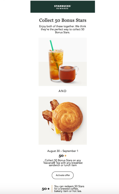
Starbucks customers and members —the people who have converted and signed up to receive company-related information and rewards — may have seen this email, or something similar, in their inbox:

The email complements all of Starbucks’ marketing materials and branding. There’s plenty of white space to separate the concise yet helpful written information that’s paired with artistic and visually-pleasing photos of their products.
The email includes a CTA to activate their email rewards offer, a link to their website to help drive traffic there, and an unsubscribe button for those who’d like to stop receiving Starbucks emails altogether.
2. Vital Proteins Email Design
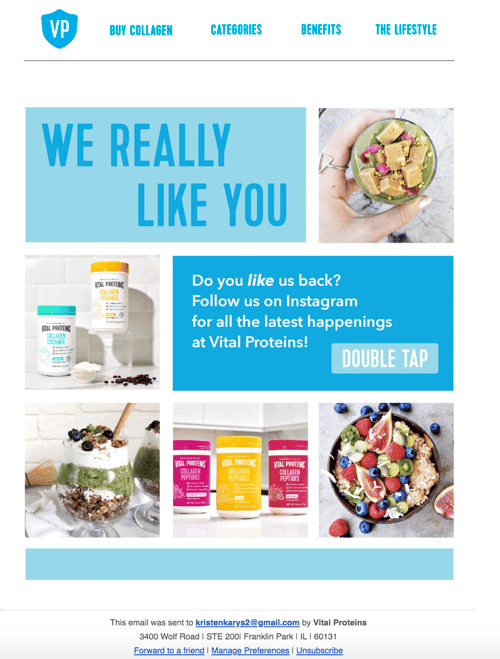
Vital Proteins' emails are sent to current customers as well as anyone who has visited their site and signed up for their email newsletter.

Although this email design contains many images and a lot of information, it’s neatly organized so it doesn’t feel overwhelming to visitors. The email’s colors, font, and unique images are on-brand and feature the company’s products.
It includes an obvious and large CTA that redirects recipients to their Instagram page to increase their number of followers and enhance brand awareness. Lastly, there are buttons at the bottom of the email for unsubscribing, changing email preferences, and forwarding the message to a friend.
3. HubSpot Marketing Blog Email Design
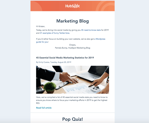
HubSpot sends subscribers Marketing Blog emails every day. These include a few blog marketing-related articles to read and learn from. If recipients choose, they may also subscribe to HubSpot’s Sales Blog and Service Blog emails.

The marketing blog email feature HubSpot branding so readers immediately know who the email is from and what it's going to include. There are previews and short descriptions of what each blog article in the email is about as well as an interactive pop quiz.
The email has plenty of white space to ensure it doesn’t feel or look cluttered and includes a personal note from the marketing blog editor to humanize the email and foster a personal relationship between readers and HubSpot.
Grow Better With Great Email Design
With great email design, you’ll grow better — meaning, you’ll reach and resonate with your audience members more effectively. Eye-catching and impactful emails will help you build long-lasting relationships and convert more people into paying customers and brand advocates. So, begin designing your emails while keeping the best practices and examples we reviewed in mind.
No comments:
Post a Comment