In the summer, there's so many things I enjoy: The sun, the temperature, chilled drinks, BBC's Pride and Prejudice miniseries, but most of all … my summer subscription box.
The seasonal subscription box I'm subscribed to gives me a little something extra to look forward to every couple of months, and the company has a knack for making me feel like a valued customer.
In my opinion, it starts with the website. Every time I log on, the homepage is configured to my account, browsing history, and activity:
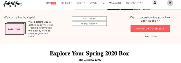
The dashboard greets me by name and gives me an update about my next box, like when it'll be shipped. Next to that, I can look at order history and manage account settings. Underneath, I can look at what I received the previous season with the option to purchase something I really love.
Websites that are designed to adapt based on previous behavior make me feel like a valued customer. Every time I visit FabFitFun, I know I won't have to follow multiple links for updated shipping information because it's displayed at the top of the page. This tells me that the company thought of a question I might have and solved for it beforehand.
If you're one of the 63% of marketers ready to update their website, let's talk about an essential: personalization. Personalized websites deliver a customized experience to visitors. They configure based on a visitor's behavior on the website, demographics, and interests.
88% of marketers believe that customers expect a personalized website experience when they visit. Static, generic websites are becoming a thing of the past. Given these figures, a multi-channel personalization strategy should be among your top priorities.
However, only 12% of marketers are satisfied with their personalization efforts. Personalization helps with traffic, customer retention, and sales. But if you aren't experiencing that with yours, it can be easy to think you're doing something wrong.
Maybe there's something you can be doing better. Let's look at examples of personalized websites that are doing it right, and tools that'll help you deliver the best visit possible to customers.
How does website personalization work?
When I visit Disney+ or Hulu after a long day of work, I don't feel like searching for new things to watch; Instead, I'd rather jump right back into The Bachelor. Hulu tracks which shows I'm currently watching and my homepage configures accordingly — so I can quickly play them without having to go to the search bar. When I do want to browse my options, though, the recommendations based on my interests have me covered.
Hulu's team thought about the intentions I might have for streaming, like to unwind after a long day, and streamlined the process of catching up on shows by offering them on my homepage. This makes me feel like a valued customer, and knowing I can easily jump back in makes me want to stay a customer. And, when I'm browsing my options, I spend a lot of time going through my recommendations, increasing my time spent on the service.
My challenges are solved before I identify them, making me an advocate for the service. This is how website personalization adds to the customer experience — by making the consumer's life easier.
You can use website personalization to give customers recommendations based on what they like, and offer premium content to repeat visitors. Ultimately, it tailors content based on your buyer personas to delight your audience.
Website personalization happens with data. Data that's collected by the website is then used to add unique features to homepages, enhancing the browsing experience for the visitor. For example, you may be recommended products on an ecommerce website based on your past browsing history the next time you visit.
Customers want their website visit to be individualized because it makes them feel valued. Having the security of knowing that I can easily repeat an order on Amazon makes me feel as if they know what I want — it's the joy of being a "regular," just online.
Personalization can happen in a variety of ways; It's not just regulated to a fancy homepage. Having CTAs that are relevant to a specific audience is personalization. Product recommendations and location-based copy are also examples.
Even though subscription services and streaming platforms are probably the most prominent examples of website personalization, nearly every company can benefit from having it on their website. Let's look at some ways B2Bs, ecommerce, and software websites are using it to engage audiences.
1. English Tea Store
I'm a huge loose leaf tea fan. Unfortunately, new flavors are hard to find — so I decided to get international with my next purchase. That's how I found English Tea Store, which offers a variety of teas, tea accessories, and sweets.
Today, I visited the website for the first time, and I explored how the ecommerce experience was personalized for leads. When I found a tea I liked, I was brought to a page that was full of customized options:
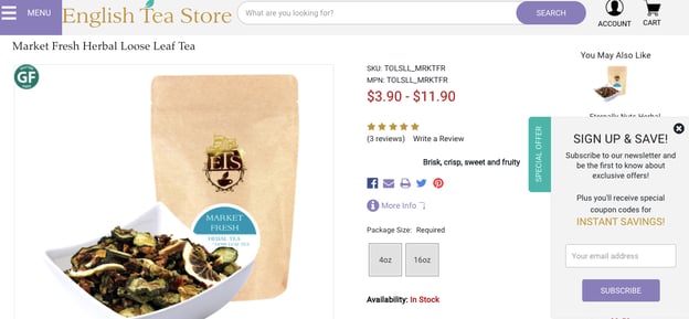
Teas I might like based were displayed to the right, catching my attention. Additionally, I was given a special offer as a lead: I could sign up for the website and use the special code for a percentage off of my first order. A completed form is one way websites collect data to improve future visits.
I appreciated having a discount offer right off the bat; it gave me an incentive to complete that form. The recommendations streamlined browsing the products on the website. Instead of becoming overwhelmed with the many offerings, I was able to navigate through a smaller set of recommendations.
If your business has a large array of products like English Tea Company, use personalization to offer recommendations based on the products viewers are exploring. To gain leads, consider adding a special offer to first-time visitors like a discount — give them an incentive to fill out the form.
2. HubSpot Academy
Every quarter, I challenge myself to learn something new. Online courses like HubSpot Academy make that easy for me with personalized homepages.
When I log into the Academy homepage, this is what I see:
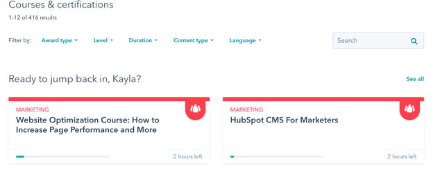
The page greets me by name and lists the courses in progress. Unlike the first example, I've been using Academy for a while, so every time I come back, I can quickly jump right back in where I left off.
Personalization doesn't have to be overly complicated. If you're a B2B marketer that prefers minimalist design, think about simple elements that will still give you the results you need. Greeting the user by name and showing previous interactions are great ways to make the customer feel valued.
3. AccuWeather
Every morning, I check the weather so I can dress accordingly. Even though I work from home, I like to match my wardrobe with Boston's unpredictable forecasts. On AccuWeather, I don't have to type a thing to find what I need.

AccuWeather's website uses location data to automatically generate the current forecast in that area. This is a great example of how a company guessed what visitors would want to know, then used personalization to cater to them.
If location-based data is huge for your company's offerings, like Zipcar or Airbnb, offer visitors suggestions based on where they are in the world. It'll make them feel like you're an expert in offerings that only locals know.
4. Google News
If I'm on a website I visit frequently, I instantly go to the section marked "For you." Google News is no exception. This app looks at my browsing history on Google and pulls relevant, recent news articles that I may like in the "For you" section.
For instance, I've been really into searching for sci-fi movies and pasta recipes lately, so I had quite an interesting mix of articles for today:
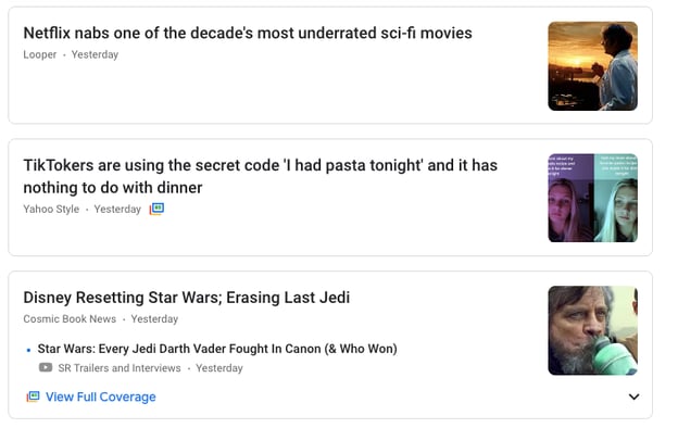
Google pulls from different sources, including websites I visit, to give a range of options for me to read. Remember, personalization doesn't have to be limited to one goal. You can use the data you have from customers to think of new content to offer them.
5. Topshop
Online shopping for clothing is tough sometimes. Often, it's hard to know what you're looking for with so many options. Especially if you don't know your sizes. That's why I really like Topshop's personalization.
The website has a quiz that gives visitors an entire edit, wardrobe, and outfit recommendations based on the answers. The quiz asked me to choose clothes I liked, what I wanted suggested, and my budget. For sizes, I go to choose from competitors I frequent, like Forever 21 and H&M, and use their sizing details to inform Topshop of mine.
After taking the quiz, this is the screen I saw (Not before creating an account, so the website could store my data):
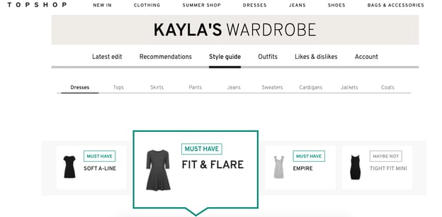
I loved that my wardrobe had a name. Plus, I liked the organization — I could choose recommendations by piece, season, occasion, or outfit. It was also cool to see what closet staples to have and avoid.
Topshop's team thought about the worries I have about online shopping and solved it with a quiz that personalized my visit. Offer a quiz or chatbot that answers questions and uncertainties first-time visitors might face. Use them to create a page just for that visitor or lead them to the one they need.
We've seen how personalization can look when it's done well. So next, let's talk about some best practices to keep in mind when you're setting up personalization on your website.
Personalization Best Practices
When website personalization works, it can account for a delightful, interactive website visit for visitors. But what about when things don't work so perfectly?
For example, what if a repeat customer visited your website and got an offer for leads? Or, what if your website gives inaccurate recommendations to audience segments? Websites that are personalized, but done poorly, may result in a loss of leads or customers.
To make sure your website aces personalization, let's look at some best practices.
1. Solve for your buyer personas.
Buyer personas are fictionalized accounts of your ideal customer. They help you identify challenges, interests, and demographic information about your audience. Figuring these things out helps you improve the effectiveness of marketing messaging.
Use personalization to create content that will be valuable to your personas. To illustrate, let's say you're part of a computer company and you have two buyer personas: The university student and the professional.
The university student is looking for an affordable, functional laptop that'll allow them to complete assignments without hassle, while the professional is looking for a sleek computer with all the bells and whistles.
To personalize your website for those personas, you can create two content offers for each; One that advertises an upcoming webinar, "Choosing Your College Computer," and one that promotes an ebook for the best professional laptops by industry. That way, when these personas visit your website, they'll see special offers that are specific to their needs.
When you personalize according to the challenges, or needs, of your personas, they'll feel like a valued advocate for your company.
2. Make the design simple.
Poor personalization can be a result of too many moving parts at once. Would you want a first-time visitor to access your homepage and be bombarded with content offers, their name plastered across the banner, and product recommendations from every section of your website?
All of these functions, while helpful, can be overwhelming when working together — and lower the load time of the webpage. To avoid a busy webpage, keep your personalization simple. Choose one or two elements that will be the most useful for your company and audience.
Think of Amazon or a streaming service. The personalization tool, recommendations, used on homepages are usually separated into minimal, relevant categories. Keep categories based on genres or audience preference — Like "Horror movies" or "Based on your last purchase."
3. Keep your goals in mind.
Identify the reasons why you're personalizing your website. In addition to thinking of your customers, keep those goals at the forefront of personalization decisions.
Let's say one of your goals is to increase customer retention. How can you keep customers coming back, outside of retargeted ads and emails? Design webpages for returners that feel familiar to them and are easy to navigate.
Save login information, make the homepage greet a customer by name, and display recommendations based on their recent purchases. That way, when customers return to your site, they'll find it easy to navigate and repurchase. In addition, they'll recognize that your company wants its audience to feel catered to directly, even online.
The ease and delight of your website will keep customers coming back for quick purchases. Because you made personalization choices based on your goals, you were able to delight your customer and accomplish your company's objectives.
4. Make sure your data is quality.
We know by now that website personalization is powered by data. This data needs to be accurate to make an impact. When you make forms, add fields that will give you the right information for personalization.
One way to do this easily, especially if you have an ecommerce website, is to use chatbots or quizzes. Think back to the style quiz from Topshop and how the questions were related to products and preferences. Use chatbots to answer FAQs leads might have.
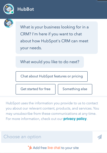
These tactics will give you the data you need to make accurate personalization choices. If you don't know about your audience's interests, it can be hard to know which strategies you should implement with your design.
The right data helps your audience do what you want them to, and nurture them along in their buyer's journey. You'll have those insights about what they want and how you can help.
5. Pick the right tools.
Behind every great personalized website is fantastic software. Choosing the right software is important — it's what powers those beautiful web pages. A CRM and a CMS work together to make this happen.
Customer relationship management (CRM) software is what you'll use to manage and organize customers, leads, and your relationships with them. It's what will store that quality data you need.
This data can range from completed forms and chatbot conversations to lead tracking. Look at the pages your visitors are returning to often and the time spent on pages to personalize offers.
Then, your content management system (CMS) will allow you to implement what you've gathered on your website. It will change based on the data it has about specific customers. Data, like location and returning visitors, can be logged by a CMS.
Next, let's talk about some software options you can use to build your website.
Website Personalization Tools
For ease, look for software that has a CRM and CMS rolled into one, like HubSpot. Software should be simple to operate and its tools should be useful to your customers and business goals.
1. HubSpot
Price: $300/mo. For CMS Hub Professional
HubSpot's CMS allows you to build and manage a stunning, personalized website. You can also leverage forms and chatbots to enhance the options you give customers to customize their experience with the software.
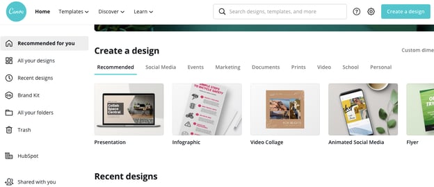
The drag and drop editor in HubSpot's software makes it easy to add smart rules or personalized features. Using the CMS, you'll collect data about the behavior of website visitors and use those insights to enhance your website.
You can also test different web pages to find out which options are the most valuable for customers. This can help you decide on a final personalization design that's exciting and functional. If you're looking for an all-in-one software package that's easy to use and scalable, check out HubSpot.
2. Barilliance
Price: Contact for pricing
Ecommerce platform Barilliance offers tools to personalize online storefronts. Options, like relevant recommendations, can help reduce shopping cart abandonment and close more sales. With Barilliance, you can optimize and customize shopping trips for every visitor.
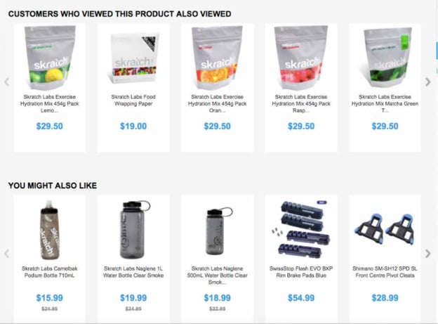
Pushys website was created using Barilliance. In the image above, notice how you can add relevant product recommendations to fit the visitor's interests. There are two categories that show off the expansive catalog of Pushys' health products.
If you have an ecommerce website that you want to tailor to every visitor, consider using Barilliance's campaign and website features to make that a breeze.
3. Qubit
Price: Contact for pricing
Personalization using Qubit is just as unique as the websites you can create with the software. Offerings are categorized into three parts: Start, Grow, and Pro. These categories target company goals and are separated by experience level.
Qubit Start is for those who just want personalization foundational tools, like chatbots or recommendations. Grow is meant for solving more specific goals — for instance, integrating customer data across platforms. Pro, on the other hand, offers different packages for you to choose.
Every Qubit category comes equipped with the same base features: tests, integrations, recommendations, and omnichannel personalization. If you're looking for software that has tools fit for your skill level and business size, look into Qubit.
4. SiteSpect
Price: Contact for pricing
If user behavior is one of your biggest goals, SiteSpect is a great option. Its tools offer personalization that is based on user data, like previous visits, sessions, and omnichannel behavior.
This data is collected by SiteSpect, which you can analyze and use to customize web pages for audience segments. When you create segments with the software, choose from an array of factors that will enhance the impact of your site, like location and device type.
Home decor company, Temple & Webster, uses SiteSpect. The "Room ideas" tab offers tons of different rooms styled using the company's products. As you scroll down the page, you can see similar ideas based on the one you chose initially.
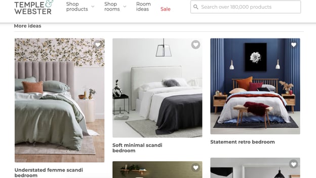
This website's personalization features are very interactive and cover a range of decor styles, so it's easy to find furniture attuned to your interests.
SiteSpect can help you build a website like Temple & Webster's — and track their effectiveness among your visitors. When you analyze campaign performance, you can know what's working and what's not, to better configure your design for customers.
5. Hyperise
Price: Starts at $29/mo.
If your company is a B2B, Hyperise was created just for you. With it, you can use hyper-personalization (using data to recommend products) to boost conversions, all without coding experience.
You'll be able to use tools that nurture leads such as IP lookup and form completion. For company branding, you can add your logo, profile images, and dynamic text. Additionally, you can create multiple, custom, CTAs to engage your audience.
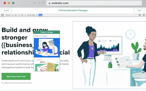
This software lets you pull data from your CRM and upload it into Hyperise, so the platform is highly integratable. Hyperise also offers an extension you can download to make it easy to continue on website building.
Maybe you're in search of a personalization tool that will integrate with your HubSpot, Salesforce, Shopify, or Google Sheets account. For that, Hyperise could be the solution.
When you visit sites that give you an amazing personalization experience, what about it makes it great? Pull influence from your favorite brands if you find yourself stuck. But ultimately, personalization allows you to take a decent website to one that behaves like customers expect it to, every time.
My subscription box order shipped today, and I can see when it will arrive from my homepage. While I excitedly await its arrival, I can't wait to see what you come up with for your shiny, new, personalized website.
No comments:
Post a Comment