How many times have you interacted with an ad on Facebook and gotten lost down a rabbit hole? If you're like me, your answer is probably up in the dozens. I could click on an ad about ice cream, and five minutes later, find myself looking at YouTube videos of homemade sundaes.
Sometimes, though, I come across an ad that's seamless — They're quick to grab my attention, and it tells me everything I need to know when I reach the landing page.
This morning, for example, I checked my timeline. I came across this ad while scrolling, and because I saw my favorite colors in the ad, I had to click on the image.
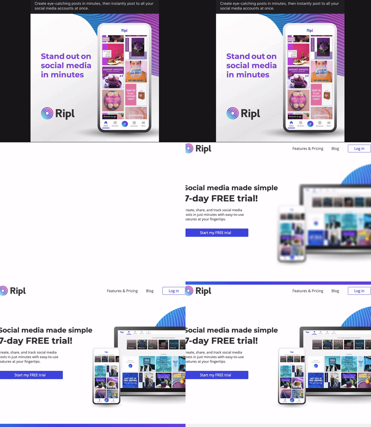
The landing page wasn't busy. In fact, the simplicity caught my attention. All the page had was text, an image, and a CTA. I noticed how the ad and landing page were centered around the same product.
It was effective because its only purpose was to get me to fill out the free trial offer, and that's exactly what I did. After all, I wanted to track my personal Instagram posts.
As far as Facebook landing pages go, this one was great.
Have you ever made a landing page specifically for Facebook ads? If the thought of creating another landing page just for social media sounds like a burden you'd rather avoid, don't worry. In most cases, you won't need to make more than a few small adjustments to one you already have.
If you're ready to dive into what makes Facebook landing pages a must for ads, read on, and let's get started.
A landing page is a web page visitors "land" on when they engage with an ad or offer. The purpose of a landing page is to drive action by offering something of value in exchange for lead information. Usually, they'll have a form to download a free ebook, receive a demo, get a template, or something similar.
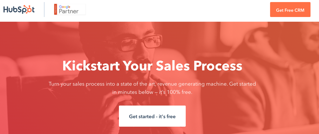
Good landing pages, like the one above, reflect the company and include at least one CTA. Facebook landing pages have the same goal.
Facebook landing pages refer to the ones attached to Facebook ads. They're still meant to entice audience members to take action, but are optimized for use on Facebook.
Just like there's best practices for creating landing pages for your website, there's some for those linked to Facebook ads. They have to do with your ad goals and optimizing the content for audiences.
They shouldn't differ largely from landing pages on your website, in fact, they should mirror your brand. You'll just have different things to look for — So instead of traffic being the number one priority, now it might be the number of shares or comments. If you're someone who benefits from visual examples like I do, don't worry, we'll go over best practices, as well.
So let's dive into how to create a landing page that'll be an amazing experience for your Facebook audience.
There's no landing page creation tool for Facebook, but you can insert them into ads via Ad Manager to boost leads and conversions. Even without this function, the website has general pointers for making your pages stand out to audiences.
Facebook suggests making the page easy to navigate. The content should be straightforward and relevant to its supporting ad to prevent confusion. And finally, match the page with the overall branding of your website.
Those are pretty straightforward, right? Upload a page that's comprehensive and branded. But there's a little more to it than that — let's take a deeper look at creating Facebook landing pages.
For this example, let's pretend I'm creating a Facebook landing page for an ebook offer. The ebook is directly related to the services my fictional PR company, Off The Press Release, provides. This offer and ad are intended to increase conversions.
1. Choose a template.
I am not a website designer, so I decided to use a landing page builder to make mine, and it turned out looking awesome. For this design, I decided to use Wix, but you can use any software with webpage tools, like HubSpot or Mailchimp.
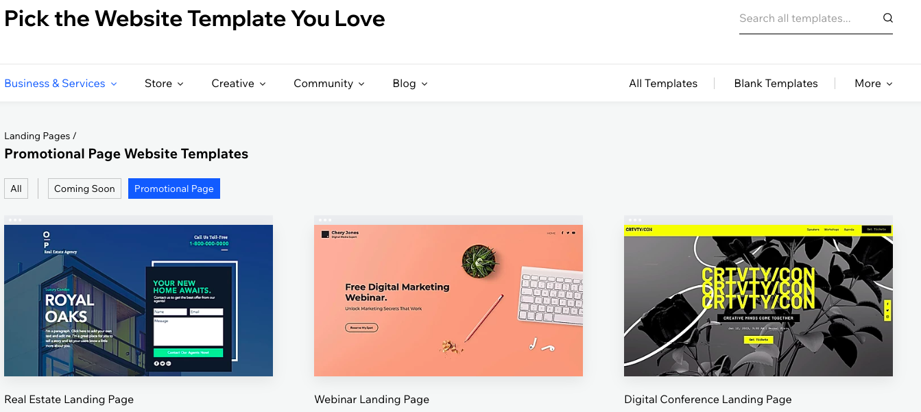
When picking my template, I wanted to go with one that would best serve my offer. I decided that one with a simple form and text — that way, I wouldn't have much to edit, and the static design wouldn't distract Facebook viewers.
A simple template for a conversion ad is ideal. Landing pages should be a simple design so they don't distract audiences from engaging with the right content. In this case, an ebook offer.
2. Brand the content.
With a template picked out, I changed the design to fit with my brand. First, I added new colors: Pink, and midnight blue, to match my company. Then, I changed the text to appear more conversational and relevant to my offer.
I wanted my copy to connect with my Facebook audience. Additionally, I chose colors that were appealing — They weren't too bright or dim.
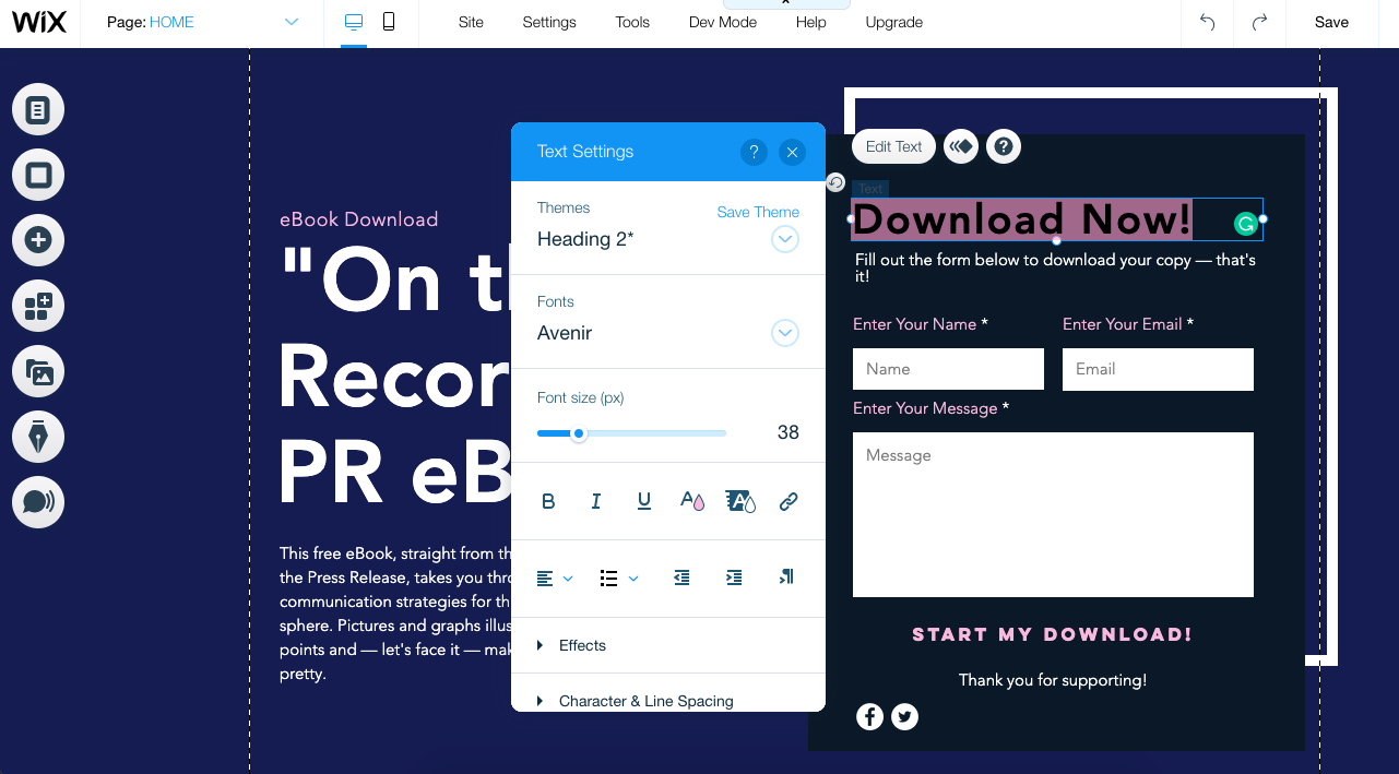
Think about which logo, images, and copy will make your message come across the best to your Facebook audiences. If you've noticed your audience responds really well to cool tones, use the darker versions of your company colors for assets like landing pages.
If you're stuck with coming up with copy that'll speak to your customers, or want branding advice from experts, we've got you covered.
3. Make the CTA the star of the page.
This ad's goal was to earn as many downloads as possible. To make that happen, I used the design to make the CTA the star by placing it in a visible position on the page. Doing this makes it only easier for audiences to complete the action.
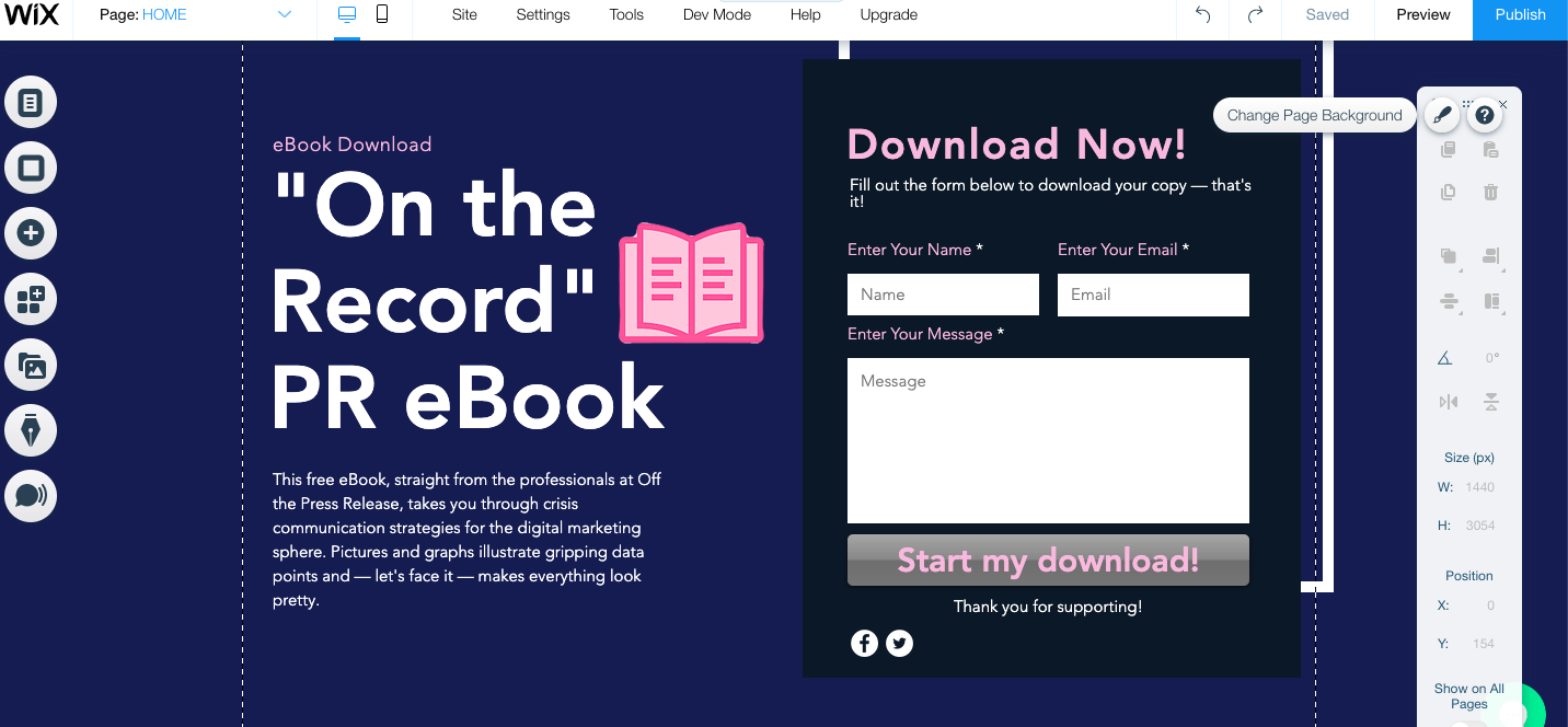
The action you want Facebook users to take on your landing page should be clear. All copy should point to a clear CTA. It's helpful to make the button a different color. I chose gray, for instance, because it was a color I hadn't previously used.
Or let's say you work for a retail company. If the ad intent is to boost sales, the landing page could be an offer for a percentage off in exchange for signing up for emails. Whatever you're giving the consumer should be front and center, along with the button to get there.
4. Preview and test your page.
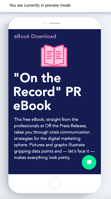
When you're satisfied with your page, view it in preview mode. Seeing it from the viewer's perspective catches mistakes. Additionally, you can make last minute changes to best fit multiple screen types.
If you have the time, test your page. One of Facebook's Paid Ads managers, Nicole Ondracek, cites testing landing pages as a must. "Testing is very useful because we have the most concrete data about how to make our pages more effective for Facebook," she says.
Check to see if your software has testing features. Mine did not, but HubSpot's CRM and Facebook both have testing tools that could give useful data, like conversions and click-through rates. I could run a landing page A/B test using HubSpot's software, then test the ad using the winning A/B test page.
5. Upload it into the Ad Manager.
When you're satisfied with your landing page ad, save it and switch gears over to Ad Manager. From here, the process is pretty intuitive — especially if you've created an ad before. After picking your ad type, it's pretty much just filling in numerous fields.
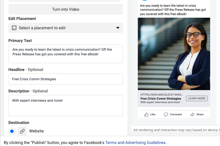
The fields "Primary Text," "Headline," and "Description" are going to be visible to audiences, so fill them in accordingly. For example, the primary text of my ad introduces my company, the offer, and what's inside.
Headlines emphasize the offer's subject, while the description gives more detail. Every field but primary text is optional, so you don't have to make the ad as wordy as I have. Add enough text to convey what you're advertising and the tone of your company.
As soon as you've got these fields settled, you've chosen your target audience, your ad is ready to run. Click "Publish!" to finish configuring details like budget and duration. And, if you need a full guide on setting up a Facebook ad, this post is an amazing help.
So now, you know how to make a landing page for Facebook ads. Now, it's time to go over how, and why, to optimize those landing pages for audiences.
Facebook Landing Page Best Practices
Think about the intent of your audience. What kind of landing page will make them interested in your offer? These design and optimization tips are a handy bookmark to make sure the content lines up with customer preference.
1. Give the page its own URL.
If you're using a landing page that already exists, and you want to track leads from Paid ads, give the page its own URL. Direct response ads, ads that are meant to incite immediate action, are generally used for lead generation.
When you give your Facebook ad landing page its own URL, you'll be able to see the leads earned specifically from that ad. Additionally, if you want to make small tweaks for Facebook performance, you can do so without modifying the original page.
2. Keep the design free of distractions.
As marketers, we know that landing pages should be simple. For Facebook ad landing pages, this is especially true. Your ad goals most likely center around audiences taking action, and a clean landing page supports that.
If your landing pages outside of Facebook usually include clickable logos and text, remove them for this version. For instance, this landing page on HubSpot's site has a clickable logo and text. The Facebook version, however, doesn't. It distracts from the overall purpose of the ad.
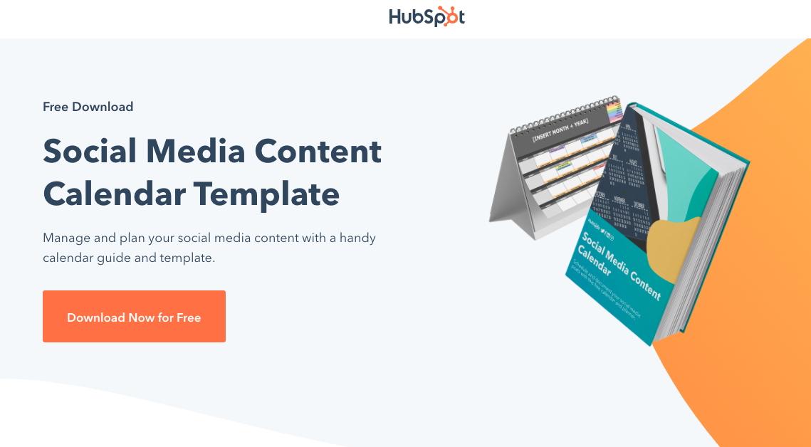
When you're designing your landing page, use the page space to make CTAs visible. Copy should succinctly reflect what's being advertised on Facebook. For instance, the Facebook landing page above leverages branding, large fonts and photos, and an actionable button.
3. Create according to your ad goals.
When you create a Facebook ad, you have to choose an ad type. These ad types reflect the ultimate goal of your campaign, like lead generation. Your landing page should be designed according to that campaign objective to maximize their effectiveness.
A landing page should be made with a purpose in mind. For example, a brand awareness ad can be broad — it's just introducing audiences to a company. However, a page for conversions should specifically lead viewers to download the ebook or demo.
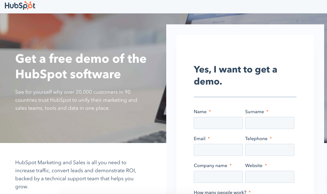
This landing page, for instance, has the form at the top of the page to help grow conversions. There's little room for distraction — the only interaction available is filing out the form.
4. Add the Pixel feature for optimization.
Pixel is a Facebook feature that was designed to boost ad performance. Adding Pixel to your ads is like adding an extra targeting feature.
Let's say a 35-year-old woman in an urban area clicked on the landing page and completed an offer for a brand awareness ad. Facebook then tells Pixel to suggest the ad to profiles with similar demographics in order to reach more qualified leads.
Essentially, Pixel targets audience members based on the demographic information of people who've previously interacted with the ad, and increases the amount of traffic your landing page earns.
5. Track the right metrics.
If you want to track landing page performance, make sure you're looking at the right metrics. Facebook will offer you an analytics report based on your ad type, and there's a few you can attribute to the landing page.
Ondracek recommends looking at the amount of money spent, forms filled, and conversions. Staying in budget for your ad campaign is a no-brainer. The amount of forms completed lets you know if your form was effective for converting leads, and conversions shows you how many.
When tracking performance outside of Facebook, add UTM parameters. This is basically a special tag on a URL that'll track page performance. UTM codes can be imported into analytics software, like Google and Looker.
You don't have to track landing pages using different services. However, if you made your page using marketing automation software that offers analytics, they're worth keeping in mind. Additionally, UTM codes will give you analytics you can compare with Facebook and other software.
Having multiple sources of data, Ondracek recommends, gives you a more holistic view of landing page performance.
6. Test landing pages frequently.
Test your landing page before it goes live, if possible. If you used software that offers testing features, use them to test the effectiveness of your page. Even though it won't be connected to Facebook, you can make small changes before uploading based on test results.
"We build landing pages using HubSpot, so we use the A/B testing feature before and while we use the page. We choose one thing to tweak at a time to keep results accurate. Over time, we'll build the most effective Facebook landing pages possible," says Ondracek.
You don't have to use specific software to test your landing page. You can even use Facebook's A/B testing feature for ads. If you decide to go that route, make your ad goal conversions so landing page design will be a factor.
When created for your audience, Facebook landing pages can be an awesome tool. They jumpstart buying journeys, earn leads, and expand reach. When you track their performance, you can learn more insights about how customers interact with your company on Facebook.
Use landing pages to further inform and delight your audience. I, for one, love a good landing page, and will be looking forward to seeing yours on my Facebook timeline next.
No comments:
Post a Comment