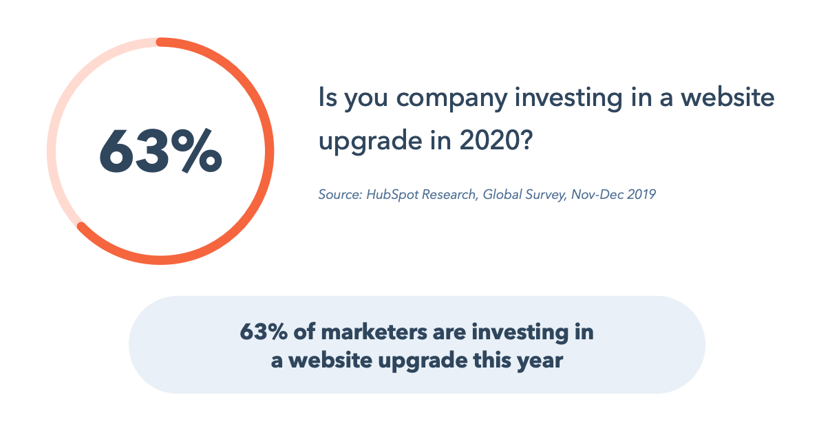
Welcome to 2020. In a recent survey conducted by HubSpot Research, 63% of marketers responded that they are looking to make a website upgrade this year. Are you?
 The discussion of web strategy can take many directions, from copywriting to conversion paths. When we consider website optimization and overall web strategy, accessibility should be one of your main objectives in 2020 and onward.
Accessibility is a broad term, but there are a few main things I will focus on in this article: a continuous monumental shift to mobile devices, transparency and disclosure of information, and properly interpreting user intent. In 2020, build your web strategy around your audience's needs first. Providing a great user experience will allow you to more easily deliver your message and meet your business goals.
Keep Being Transparent: If People Can't Find It on Your Site, They'll Find It Elsewhere
Continue to lead with transparency. Websites have come a long way from just pretty online brochures — done right, they're now your best tool to build trust and credibility with prospects and customers. Users want to feel that they are in control of their site experience, so help them get there by sharing more, not less. Public-facing pricing pages are a great example; making your pricing readily available to your customers lends credibility to your brand, and qualifies/disqualifies prospects for you. Additionally, help them find your pricing quickly by including it in your primary navigation and on your home page. Make your pricing easy to understand and have clear call to action to complete the sale.
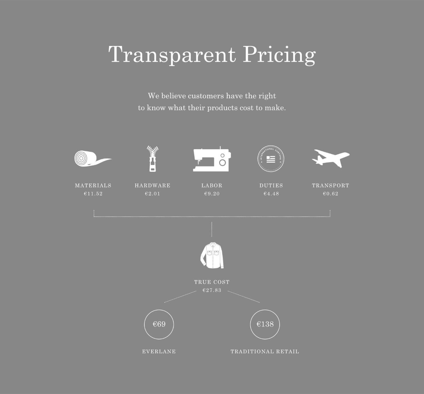
One B2C company that sets the standard for this is the clothing company Everlane. On all of their product pages, they have a section that looks like this:

This honest and revealing approach to their pricing builds trust in their brand and makes the customer feel more in charge of their purchasing decisions.
Product reviews are also a valuable tool; your prospects generally trust other customers' opinions, so use that to your advantage. By proactively disclosing this and other information, you get to lead the narrative and tell your story your way.
Prospects will find honest reviews about your product whether or not you choose to feature them on your site, so taking the lead and featuring them on your product pages helps keep them on your site and builds credibility in your brand.
Pricing pages and product reviews are just two ways that you can use your website to persuade buyers, encourage advocacy, and decrease the friction in your sales process. If you can keep a potential buyer on your site, rather than looking for this information elsewhere, it's a better experience for them and you.
Start Solving for Mobile and Accessibility First, and the Rest Will Fall Into Place
Mobile usage rates continue to rise, including a huge shift in business-to-business in just the past year or two. Overall web traffic from mobile devices now represents 52% of web traffic worldwide. At HubSpot, 46% of our blog traffic comes from mobile.
If you have not yet embraced a mobile-first approach, now is the time. By approaching copy, design, and conversions with a mobile mentality, you will improve your desktop experience as well. This approach will force you to be more thoughtful and concise with content creation.
I'm not suggesting you create less content; instead, focus on clarity and conciseness. Bite-size information is always best for grabbing attention and enticing your audience to read more.
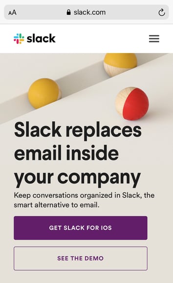
Slack has done a great job with this. Their mobile site is fast, beautiful, has concise messaging, and features custom smart CTAs for whichever type of phone operating system you are visiting the site from.

As you start to think more about mobile, you also have to focus on accessibility.
At HubSpot, accessibility is a focus in 2020. We run our site on HubSpot CMS, which has made it easy for every marketer to create and edit content, and we're working diligently to improve our website accessibility for all.
To help us, we spoke to Christina Mallon, the Accessibility Design Lead at Wunderman Thompson. Christina started her presentation with “What if I told you that your marketing content was excluding an audience of roughly 61 million people in the United States? 1 in 4 people live with a disability in the United States."
This further enforced our belief that accessibility should be a requirement for every marketer going forward. We aren't perfect, but we have put together a task force to improve our process.
If you're looking for a starting point, try studying the Web Content Accessibility Guidelines (WCAG) to ensure your process for web design and content production is inclusive.
Be mindful of font and type size to help drive better user experience. Ensure hyperlinks are easily identifiable. What types of content could you add to consider more users? Maybe you could add subtitles to your videos for the hard of hearing. Or, perhaps you could add a page reading feature to your blog. Making experiences accessible for those who need it makes them better for everybody — design for the edges and the rest falls in.
Stop Giving Users Limited or Outdated Choices
As the saying goes, it's not about you. Stop forcing your site visitors down the conversion path you want them to take. A classic example: You visit a site, and the only call to action is a “Contact Us” link that sends you to a form and (potentially) into the void. Instead, ask yourself — what is best for your audience? How and when do they want to interact with you?
Start by making the effort to understand users' intent. Different visitors are looking for different types of information based on their familiarity with your business and position in the buyer's journey. Perhaps it's educational resources or a support center for customers, or maybe it's someone who was referred to you by a friend and is ready to talk to your sales team.
You should be able to create a general website map that connects the most appropriate calls-to-action for different sections of your site, and you can run experiments over time to optimize the best user experience and conversion rates for your business on specific pages.
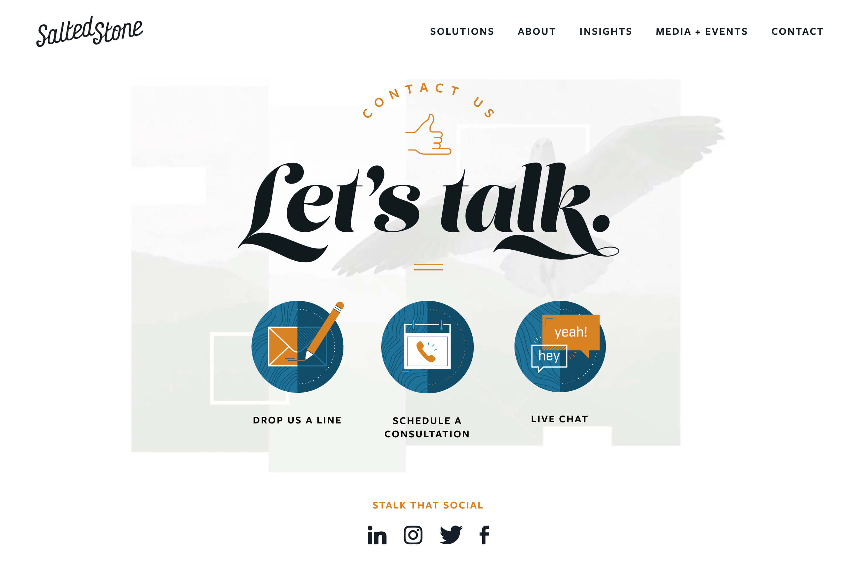
Oftentimes, different visitors on the same pages have different preferences or needs, so don't limit them to just one choice. You don't need to throw away that “Contact Us” page with a form — try adding the phone number for your sales line or online chat — you can use a chatbot if you don't have live chat agents available. At HubSpot, we've seen great success with our calendar tool that lets users schedule a meeting to talk to sales at a time that's convenient for them. Another great example of this is Salted Stone's contact us page.

Give your audience an opportunity to get in touch however and whenever they choose.
My Recommended Web Strategy Resources
Here are a few of my favorite tools for improving our web experience:
-
Stark: Contrast checker and colorblind simulator
-
WAVE: Web accessibility evaluation tool
-
Lighthouse: Good for testing page load time
-
BrowserStack: App and browser testing
Take a Deep-Dive Into the State of Web Strategy
I'm excited to see where you take your web strategy in 2020. Remember, lead with the user, and if you need some data to help guide these decisions, get access to over 70 data points and trends from over 3,400 marketers around the world. Dive deeper into HubSpot's survey data by downloading the full "Not Another State of Marketing" Report.
No comments:
Post a Comment