"You've got mail."
At least, that's what you're hoping as a digital marketer — to show up in your audience's inbox.
That's because capturing emails is an important tactic marketers use to gather leads. To do so, you've probably created a lead magnet or content offer.
It's a tale as old as time for those in online marketing. And that's because it works.
By the end of 2020, the number of email users will grow to be 3 billion worldwide. Additionally, email has an average ROI of $38 for every $1 spent.
The fact is, email marketing is still an effective channel in digital marketing.
So, how do you capture emails? One tactic is a squeeze page.
Below, let's review what a squeeze page is, some examples, and how to build one.
While squeeze pages are a type of landing page, it's important to note that not all landing pages are a squeeze page.
Some landing pages have multiple conversion goals, such as offering a free trial. On the other hand, the only goal of a squeeze page is to get an email address.
After a user has entered their email address on your squeeze page, you should:
- Deliver your content offer immediately.
- Show users a thank you page that answers any questions and lets them know what the next steps are.
- Send an automated message reminding users why they gave you their email address. Something that says thank you, gives users the content offer and lets them know what types of emails to expect from you and how often.
- Follow up with a drip-email campaign that will move them down the funnel and closer to a purchase.
So, what should a squeeze page look like? Usually, squeeze pages are short-form landing pages with only a small amount of text to persuade users to enter their email address.
But, how can you create a squeeze page that will generate leads? Here are a few tips:
1. Include one CTA: There should only be one CTA on a squeeze page: to enter an email address. Your CTA button should clearly state the action and end result for the user. For example, "Claim My Spot" is actionable and lets the user know that they'll be signed up for a course or webinar.
2. Write crisp, compelling copy: The supporting text should be concise and interesting. It should be easy to read and provide important information that makes users want to enter their email address.
3. Implement social proof: You might consider including one or two short testimonials below your form fields. People like to see that your content offer has helped others before.
4. Add excellent graphics: The imagery on your squeeze page should be clean and captivating.
5. Produce an enticing content offer: Your content offer should have high-value for your audience. It can be something like an email course, templates, a webinar, or an e-book.
Creating a successful squeeze page won't always happen on the first try, though. To improve conversions, try A/B testing to see what variations your audience likes best. You can test headlines, CTA buttons, form positions, background images, or copy.
Squeeze Page Examples
One of the easiest ways to guide you in your squeeze page creation is to look at a few examples. Below are three examples that could inspire your squeeze page design:
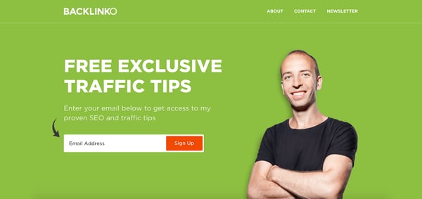
1. Backlinko's Home Page
Some marketers choose to have a squeeze page act as their home page. That is what Brian Dean, founder of Backlinko does. Backlinko's entire home page is a squeeze page attempting to get subscribers to Dean's email list.
His content offer? Exclusive traffic and SEO tips directly to your inbox.
The squeeze page includes short, crisp copy, an interesting headline, great imagery, and only one form field. It's a clean, simple page that utilizes all our tips above. If you scroll further, below-the-fold, you'll find social proof and another content offer, if the first one doesn't appeal to you.

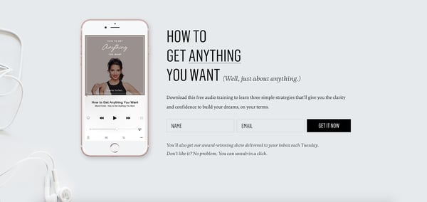
2. Marie Forleo's Get Started Page
Marie Forleo, an online digital entrepreneur, has a squeeze page directly on her website. Instead of being her home page like Backlinko, Forleo uses a "Get Started" page right in the navigation as one of her squeeze pages.
This squeeze page offers a free audio training in exchange for a user's email address. It has great imagery, copy, and a clear CTA.
Uniquely, below the form fields, Forleo tells users what they'll get by giving their email address and already lets them know they can unsubscribe. This is a great touch when users are worried about spam pages.

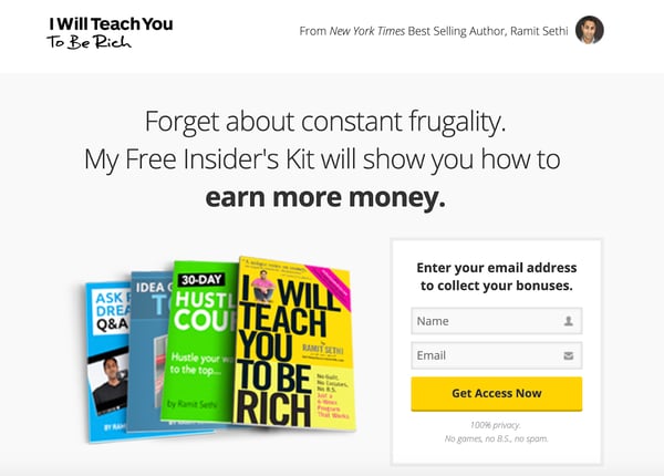
3. Ramit Sethi's Free Insider Kit
Ramit Sethi, an author and expert in making money, has a squeeze page on his website, in the form of the "Free Tools" page.
This squeeze page uses scarcity and fear-of-missing-out (FOMO) to gather email addresses. The headline uses language including "Free Insider's Kit" to make users feel like they're in the inner circle.
Additionally, this squeeze page also got rid of the top navigation bar when you click on it, getting rid of any distractions. The only goal of this page is to gather email leads.

Best Squeeze Page Builders
Now that we've learned what a squeeze page is and what it looks like, you might be wondering, "How do I create one?"
Luckily, there are a lot of squeeze page builders you can use for help.
However, it's important to make sure that whichever squeeze page builder you use, integrates with your email autoresponder service — whether that's HubSpot, MailChimp, or Constant Contact.
Below are a few of the top squeeze page builder options:
1. HubSpot
With HubSpot, you can create beautiful landing pages in the same tool you use for email marketing, your CRM, and your CMS.
There is a built-in library of mobile-optimized templates proven to convert, so you can add copy and insert images in minutes.
Additionally, you can create dynamic squeeze pages that show different content based on a user's location, source, device, buying stage, or any other contact detail stored in your CRM.
2. Leadpages
Leadpages is an easy, DIY landing page builder. With this tool, you can drag-and-drop any elements you want, giving you the ability to quickly create professional landing pages. Plus, you can look through its top, mobile-responsive templates to get you started.
Additionally, you can easily A/B test your pages right in the tool, so you create landing pages that convert right away.
3. ClickFunnels
ClickFunnels is a quick, easy tool that can help you create an entire funnel. For example, you can create your squeeze page, thank you page, and email and Facebook marketing automation. You can even create up-sell pages as well.
However, most of ClickFunnels tools are best used for other types of landing pages where you'll want more bells and whistles. But, if you need to create both squeeze pages and other landing pages, this is a great option.
4. WordStream
WordStream offers a conversion toolkit, that helps users capture more leads using squeeze pages and landing page templates.
It has an intuitive drag-and-drop builder to help you build professional squeeze pages in minutes. You can sync your captured emails directly with Constant Contact or Salesforce to streamline your workflow.
Whether you're new to landing pages or you've created them before, it's important to understand how squeeze pages can generate leads for your company — they aren't the same as every other landing page you've created. They need to be built with a specific audience in mind.
No comments:
Post a Comment